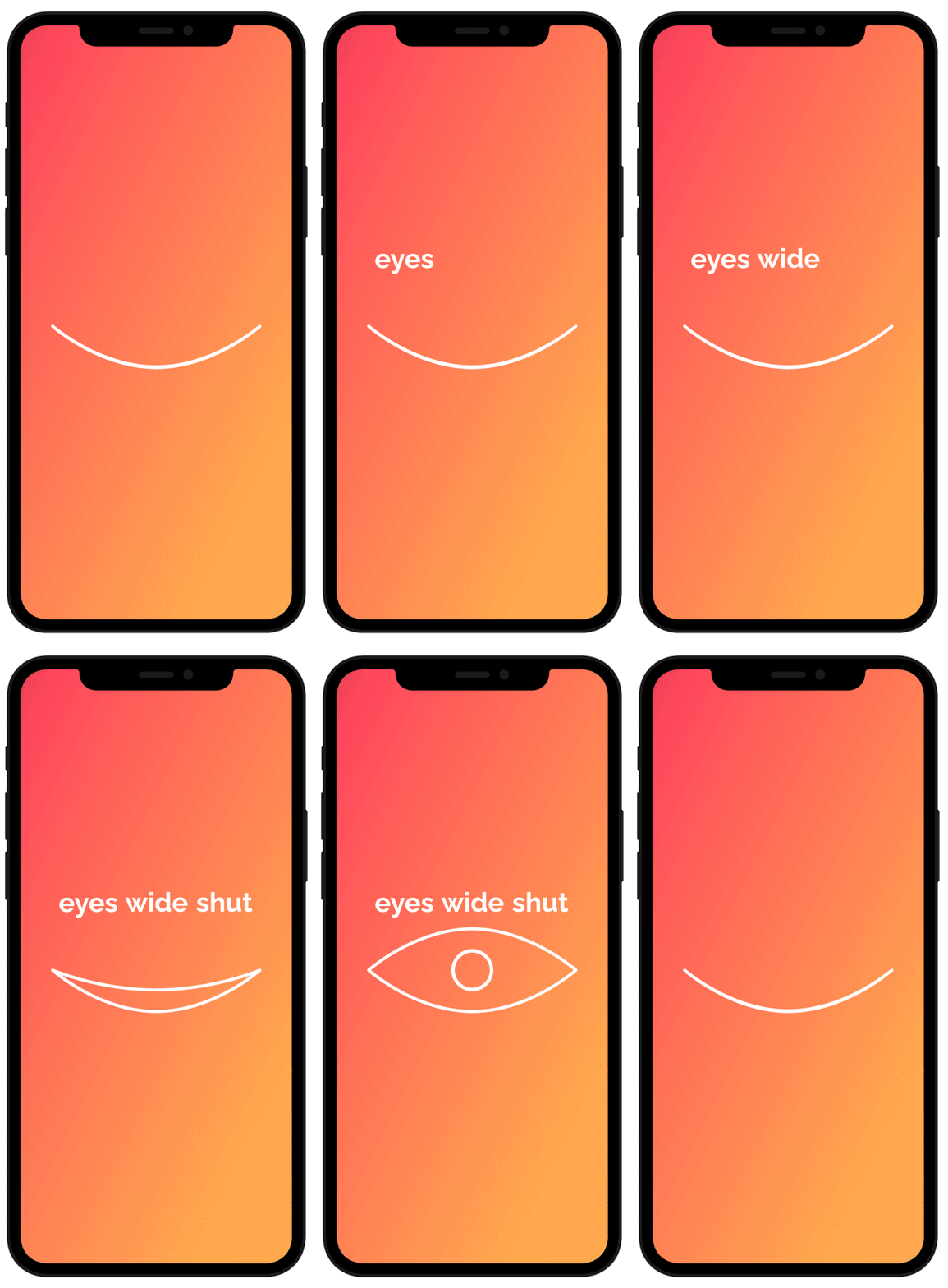
eyes wide shut Dating App
Harmony and Rodale are dedicated to inspiring and empowering readers through books focused on holistic living, wellness, and personal growth. Their titles evoke optimism and transformation, offering practical guides on nutrition, fitness, and sustainable living. With a friendly tone, these imprints encourage healthier choices and a deeper connection with oneself and the environment.
Overview
I designed a dating app that prioritizes prompt-based interactions over photos to reduce bias and encourage deeper connections. This is especially important for Black women and Asian men, who statistically receive the least engagement on traditional dating platforms. By focusing on meaningful prompts, the app creates a more inclusive and fair experience for all users.
Goals
Encourage deeper, more meaningful connections based on personality and interests.
Reduce the impact of unconscious bias by prioritizing prompts over photos.
Create a more inclusive dating environment for people of color, addressing disparities in engagement and representation on dating platforms.
Creative Direction
UX/UI Design
User Research
Wireframing
Prototyping
Branding
Prototype
App Design
Eyes Wide Shut: A Bias-Reducing Blind Dating App
Problem Statement
Traditional dating apps often lead to biases, especially for people of color, like Black women and Asian men, who statistically receive less engagement. This project aims to create a dating app where users connect based on personality rather than initial photos, reducing unconscious biases.
Objective
Traditional dating apps often lead to biases, especially for people of color, like Black women and Asian men, who statistically receive less engagement. This project aims to create a dating app where users connect based on personality rather than initial photos, reducing unconscious biases.
User Research
Target Audience
Creative men and women of color between the ages of 25-35 who are looking for a more meaningful way to meet people online. They spend a significant amount of time on dating apps and social media platforms like Twitter and Reddit.
Pain Points
Users reported feeling overlooked due to unconscious biases prevalent in traditional swipe-based dating apps, leading to a desire for an alternative approach.
Research Methods
We conducted surveys with 30 people of color using various dating apps, asking about their experiences and frustrations, and held focus groups to understand their dating preferences and pain points.
Competitive Analysis
Competitors
Tinder, Bumble, Grindr, and Hinge
Strengths of Competitors
They offer a user-friendly interface and are widely recognized, but the 'swipe' mechanism promotes instant judgment based on appearance.
Weaknesses of Competitors
The reliance on photos first allows unconscious biases to dominate, often leading to exclusion and a negative experience for people of color.
Ideation & Brainstorming
Ideas Generated
Introducing a 'blind' first interaction where users respond to prompts rather than seeing photos upfront. This would create space for deeper conversations based on personality and interests.
Prioritization
We prioritized features that encourage thoughtful engagement, such as prompt-based matches and conversation starters, rather than appearance-based swiping.
Wireframing
Low-Fidelity Wireframes
Early sketches displayed a clean interface where users would see answers to a prompt instead of photos, with buttons to initiate conversation based on the response.
Rationale
We designed the layout to be simple, ensuring the focus remained on the content of the user's response rather than on visual elements. This encourages users to invest more time in reading responses rather than making snap judgments.
Prototyping
Tools Used
Figma was used to create an interactive prototype.
Features Highlighted
The prototype showcased a prompt-first interaction flow, where users swipe through prompt answers before revealing a profile picture, delaying the photo reveal until after an initial connection is made.
Research Methods
We conducted surveys with 30 people of color using various dating apps, asking about their experiences and frustrations, and held focus groups to understand their dating preferences and pain points.
UI Design
Color Scheme
We used a bold, vibrant color palette that resonates with the target audience's creative background, incorporating deep blues and purples for a sense of mystery and intrigue.
Typography
Sans-serif fonts were chosen for readability and a modern feel. Font weight was adjusted to highlight key user responses and conversation prompts.
In Conclusion
Eyes Wide Shut successfully challenges the conventional, appearance-driven interactions of traditional dating apps by placing personality and thoughtful engagement at the forefront. Through prompt-based interactions, the app reduces the impact of unconscious biases, creating a more inclusive and meaningful experience for people of color—especially those often overlooked in online dating. By focusing on the target audience's desire for deeper connections, Eyes Wide Shut not only provides an alternative to the typical swipe culture but also fosters more authentic relationships. Moving forward, the app can continue to evolve by enhancing personalization and accessibility, solidifying its role as a refreshing, bias-reducing option in the dating landscape.


